feat(INSTUI-5156): new skeleton loader - #2720
HouseOfHawks wants to merge 1 commit into
Conversation


fix(INSTUI-5156): deleted ssr-lab

fix(INSTUI-5157): cleanup


|
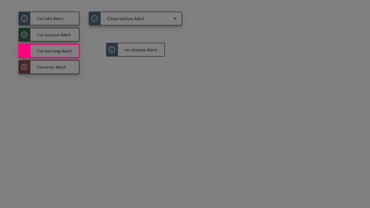
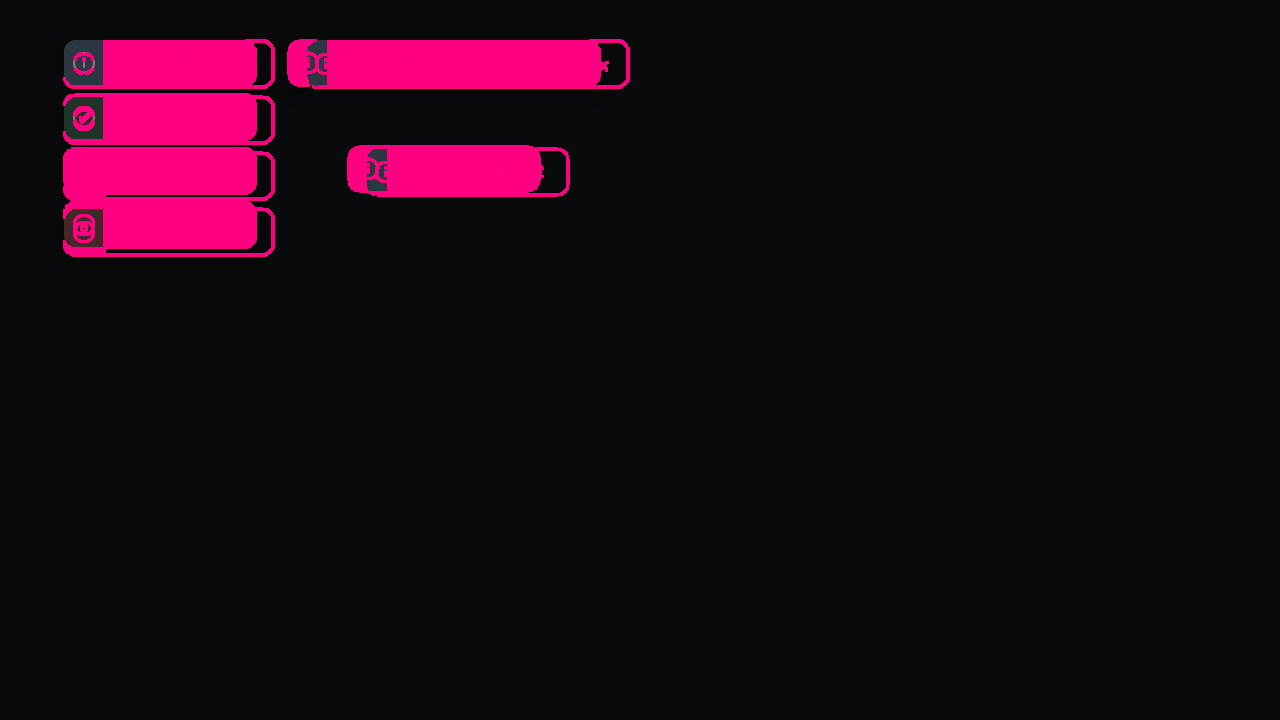
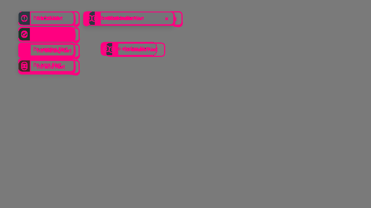
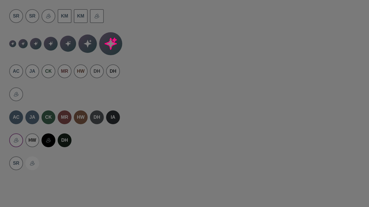
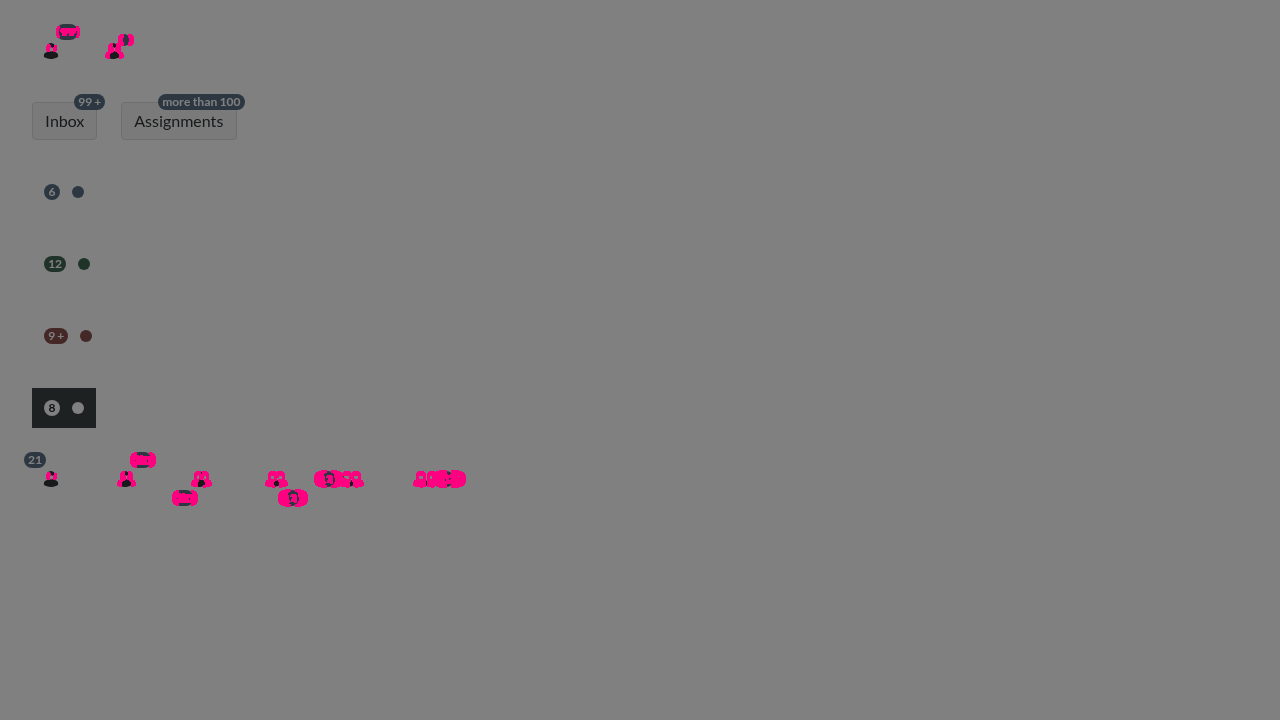
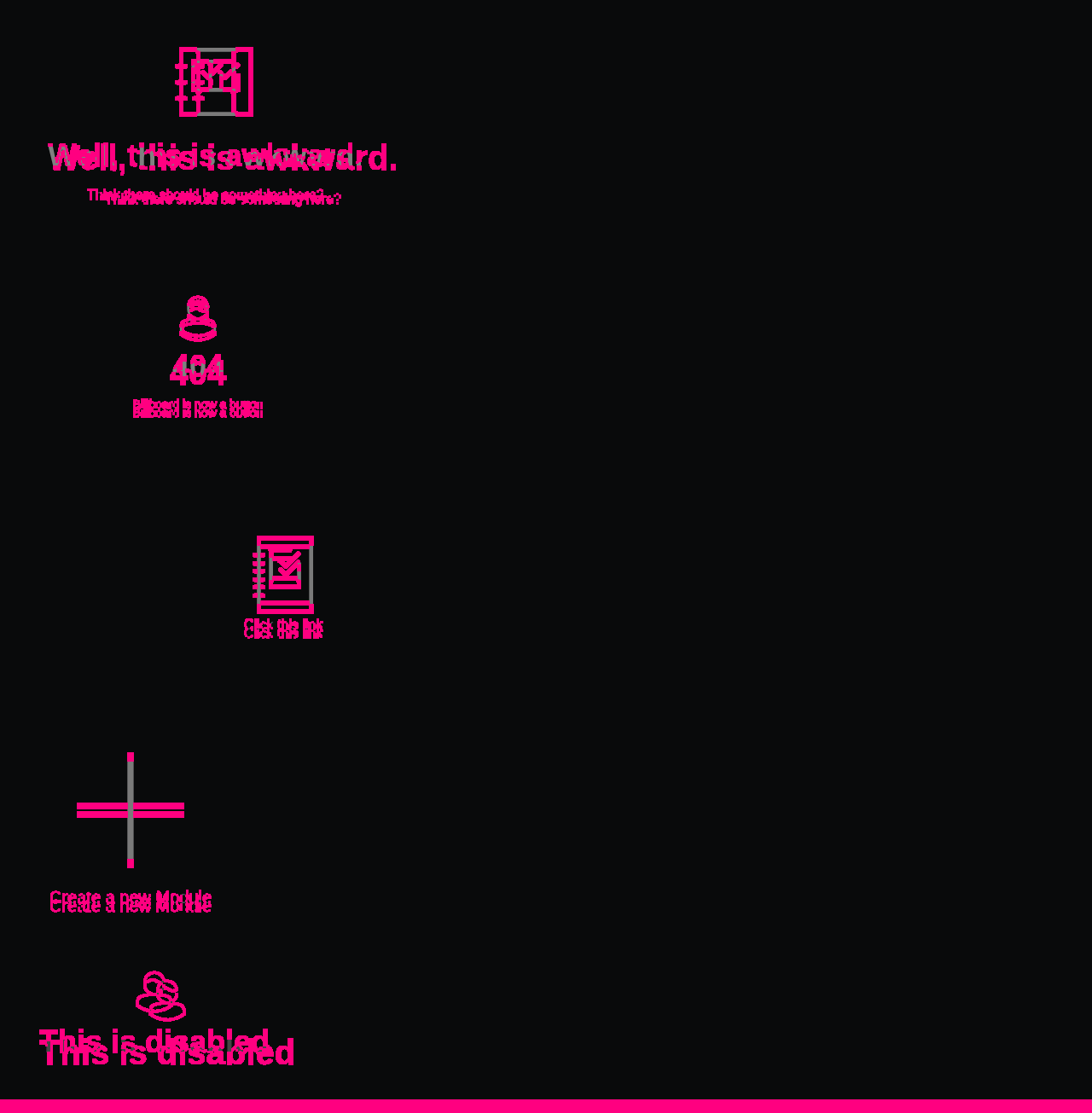
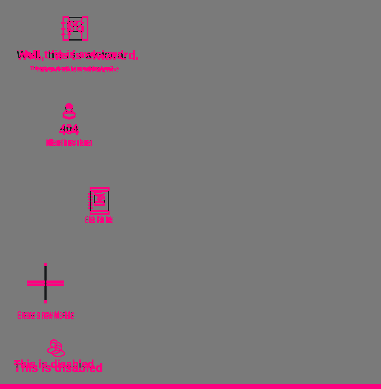
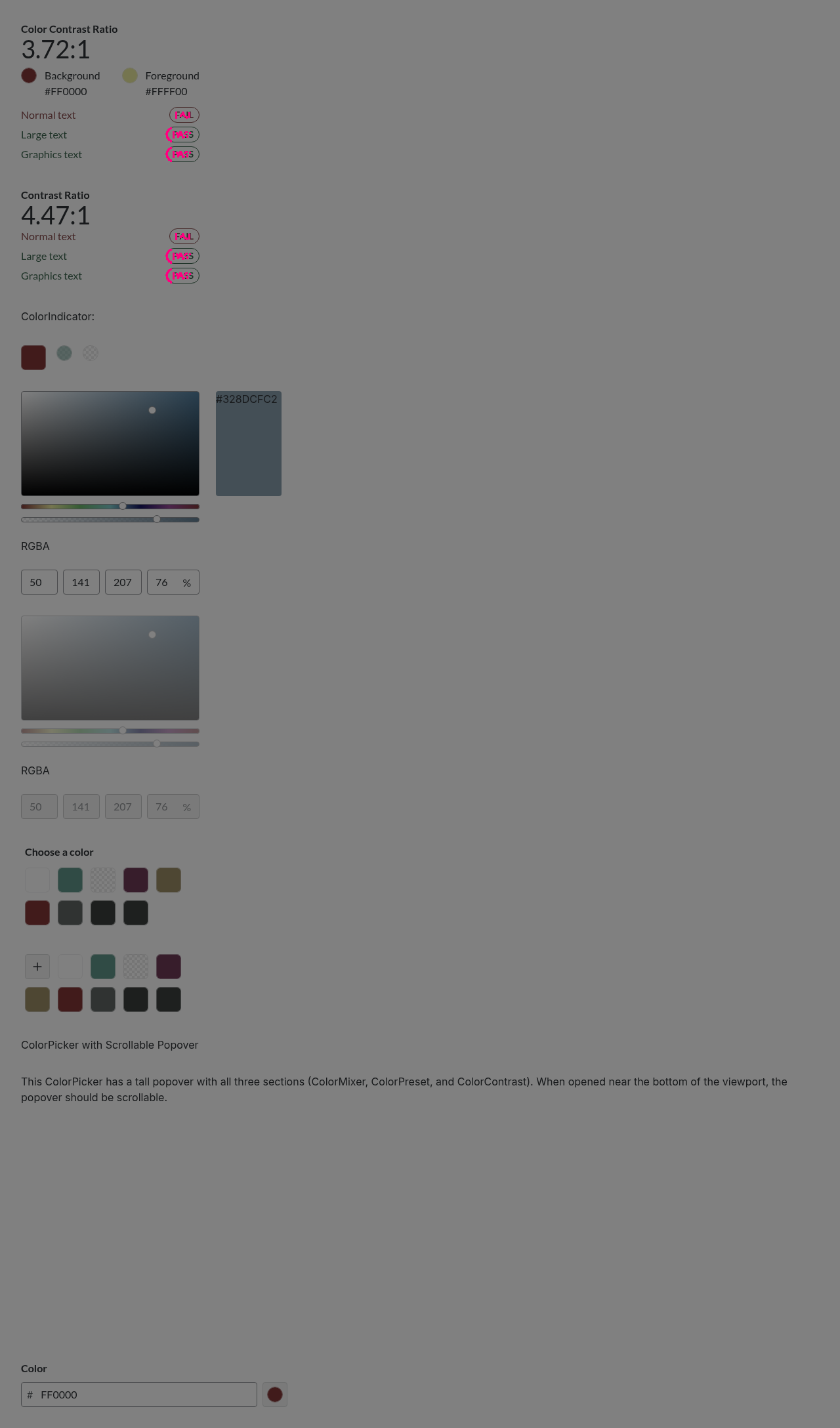
Visual regression reportCypress suite: ✅ Passing Visual diff:
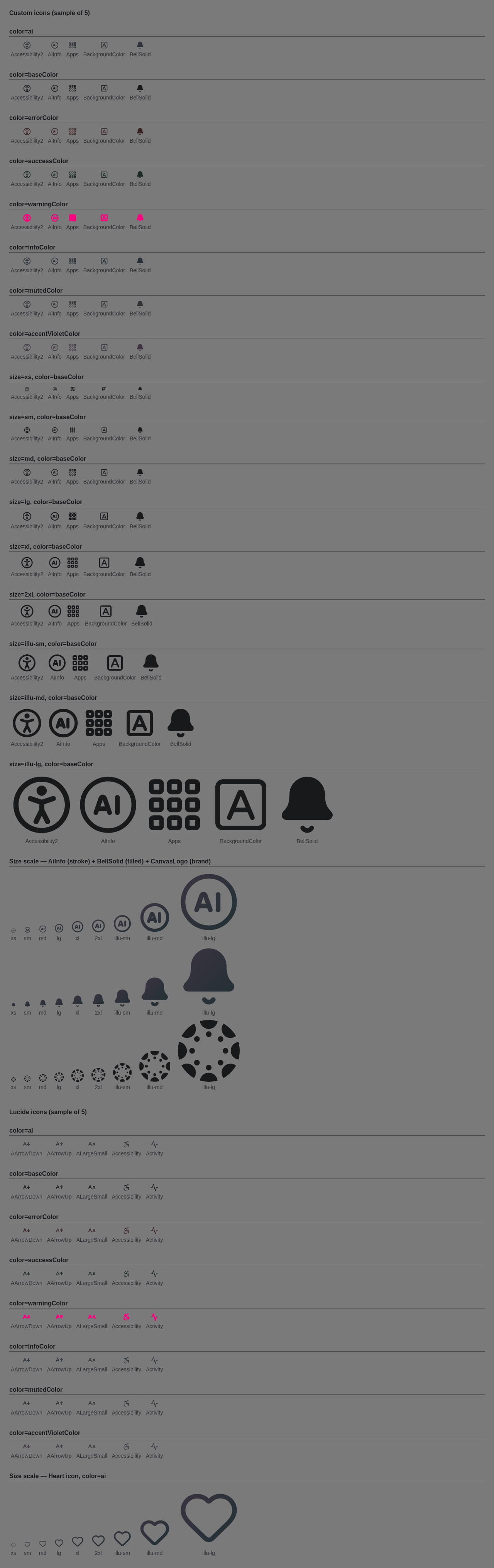
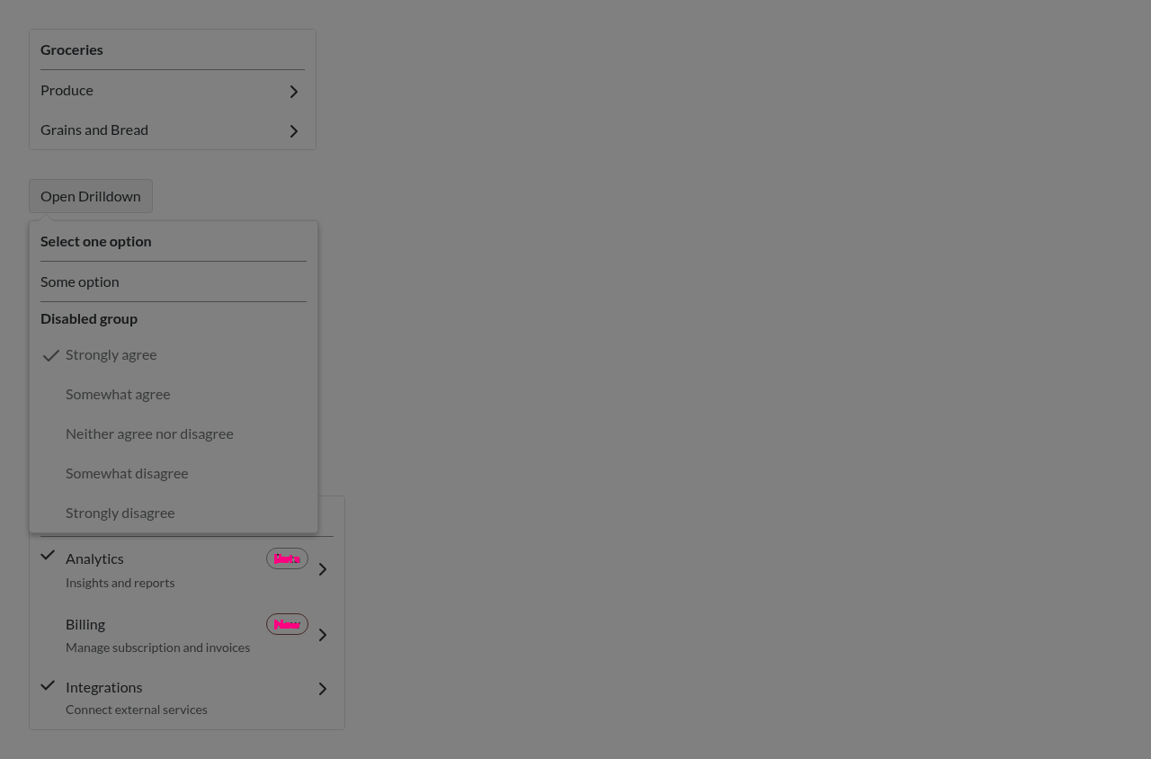
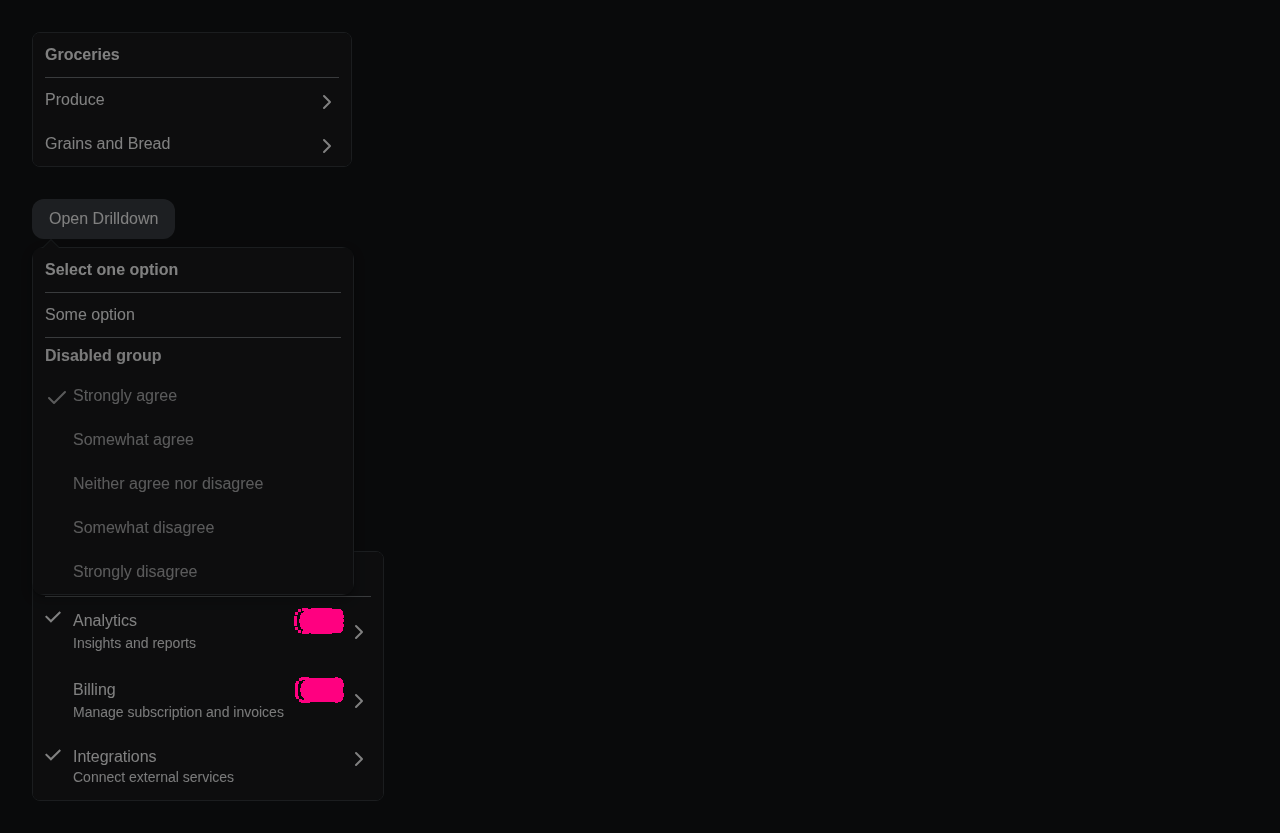
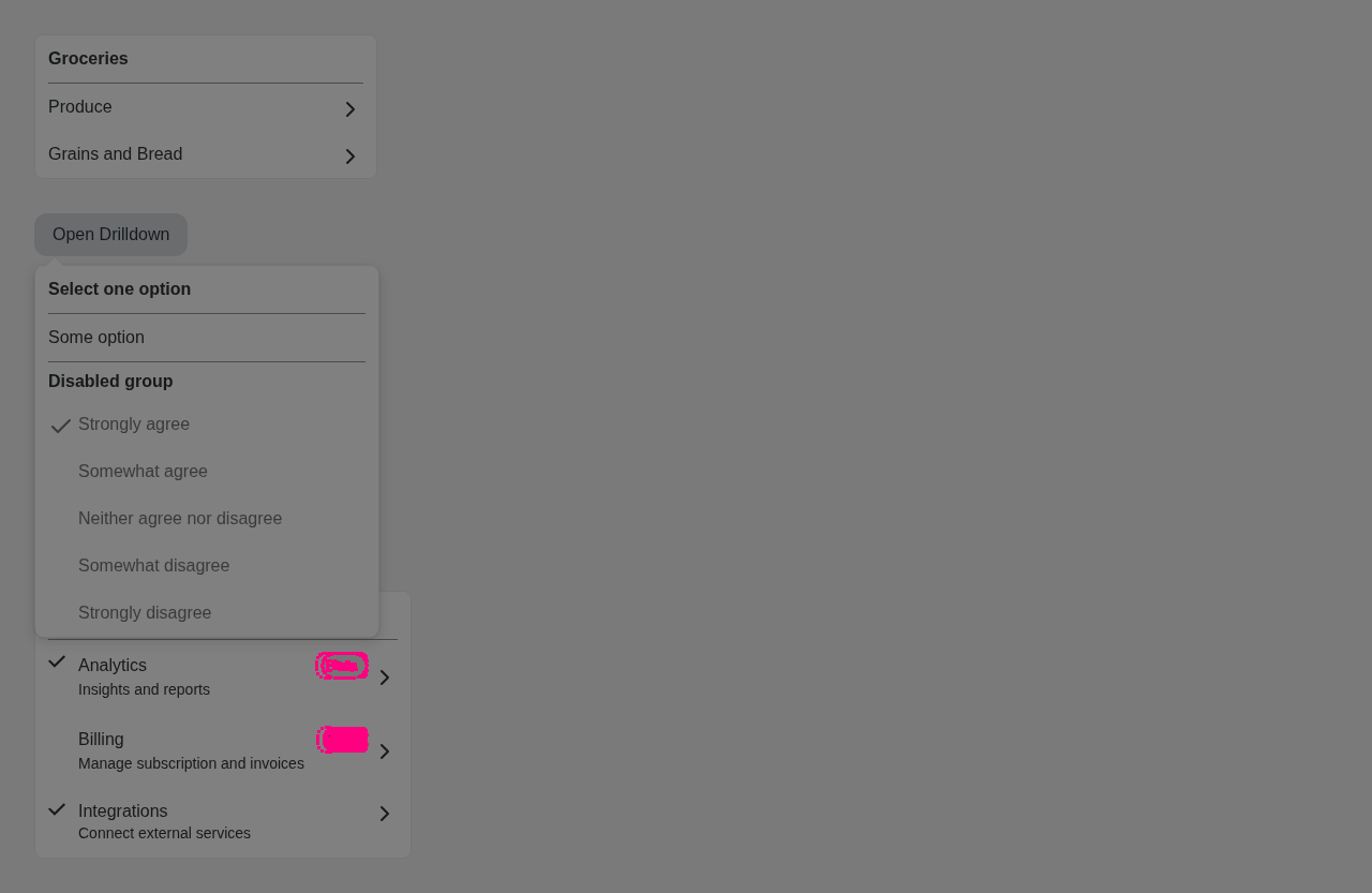
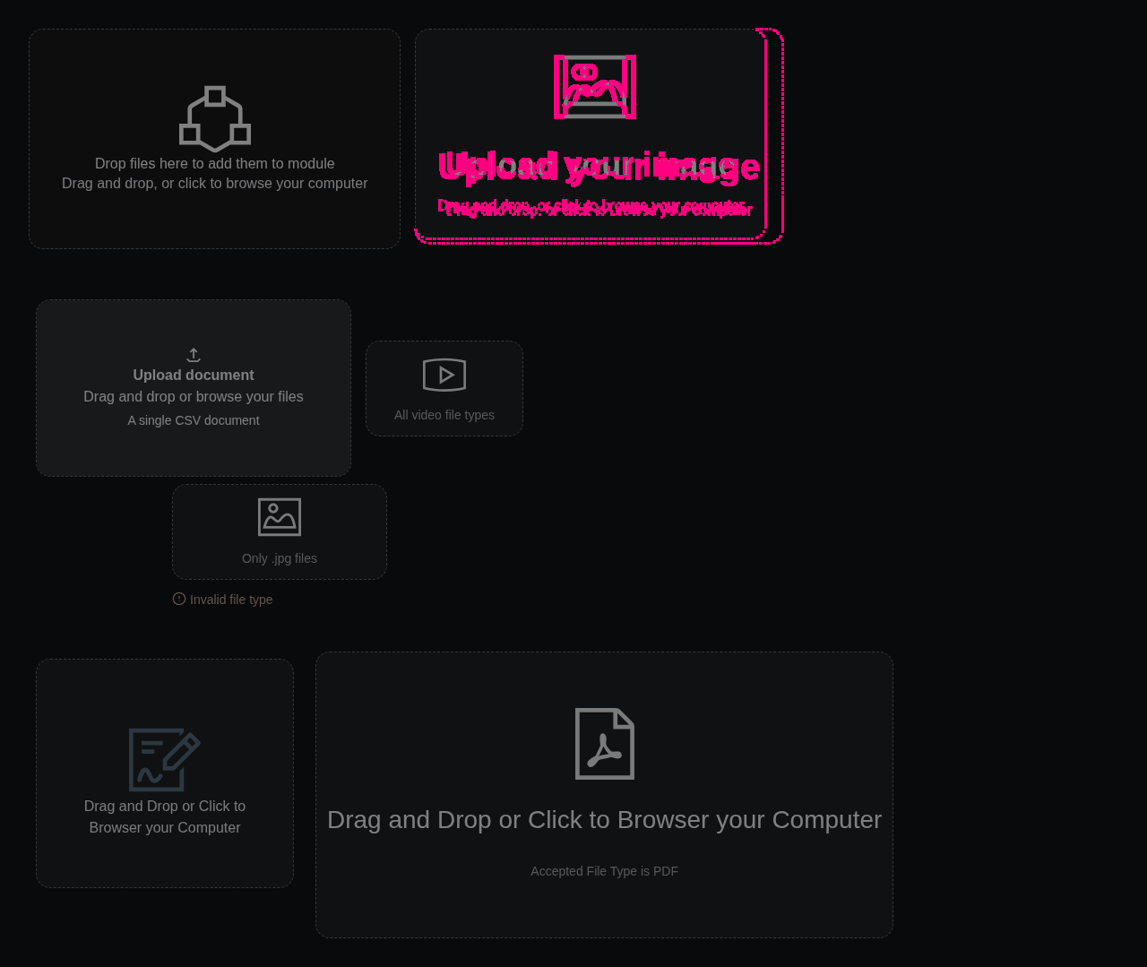
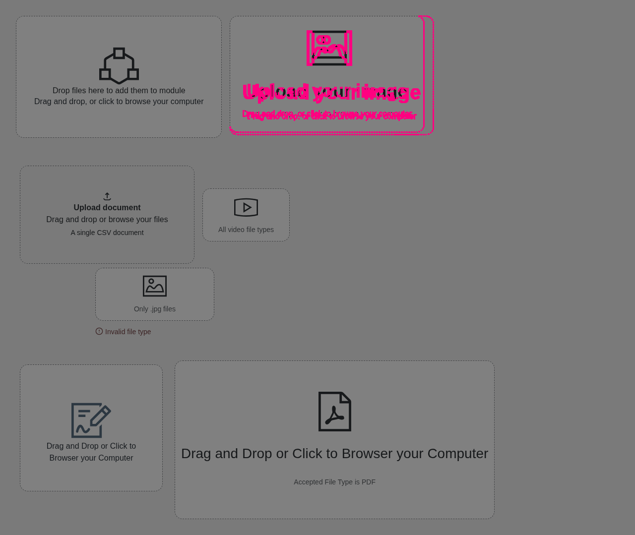
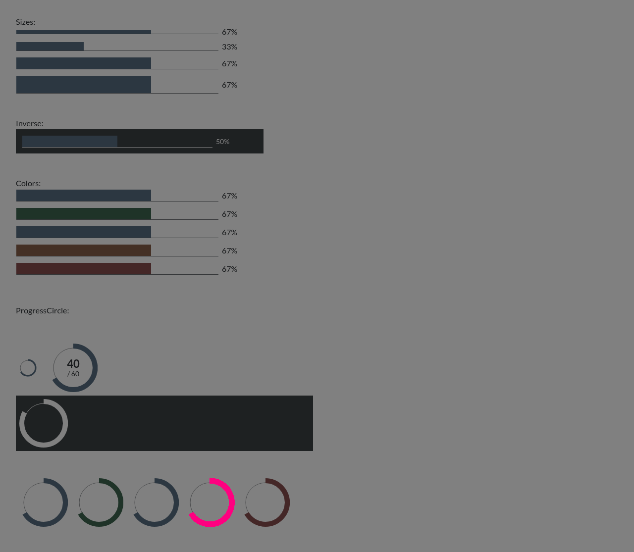
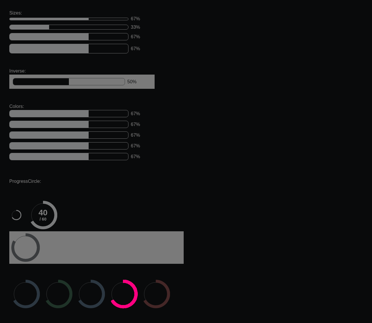
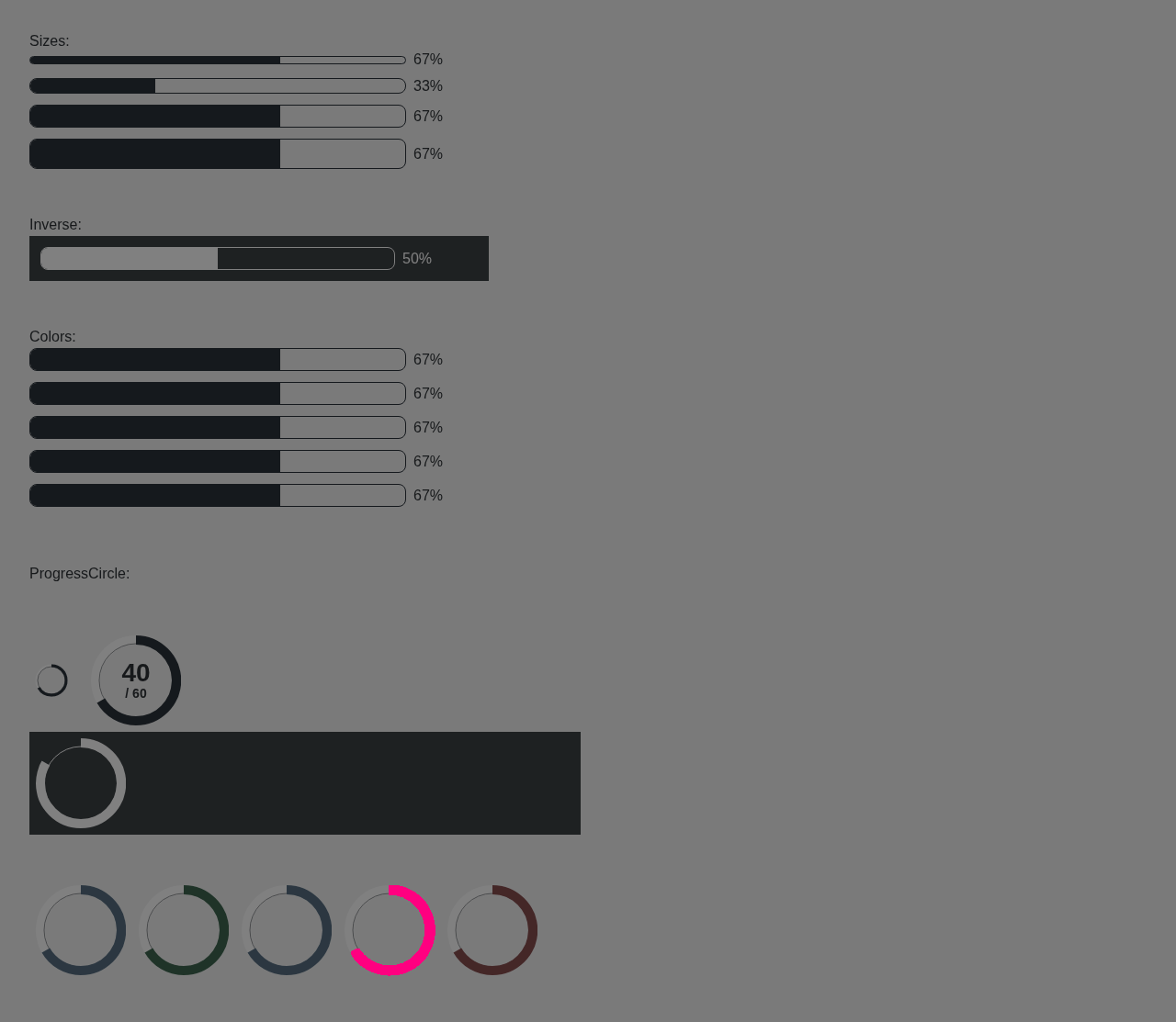
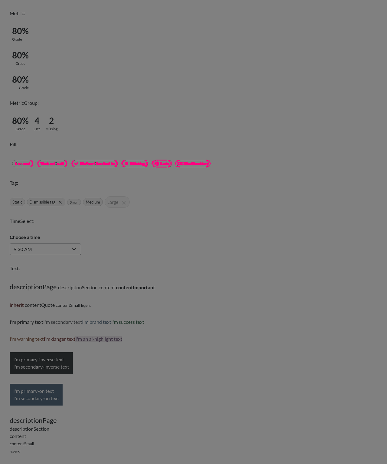
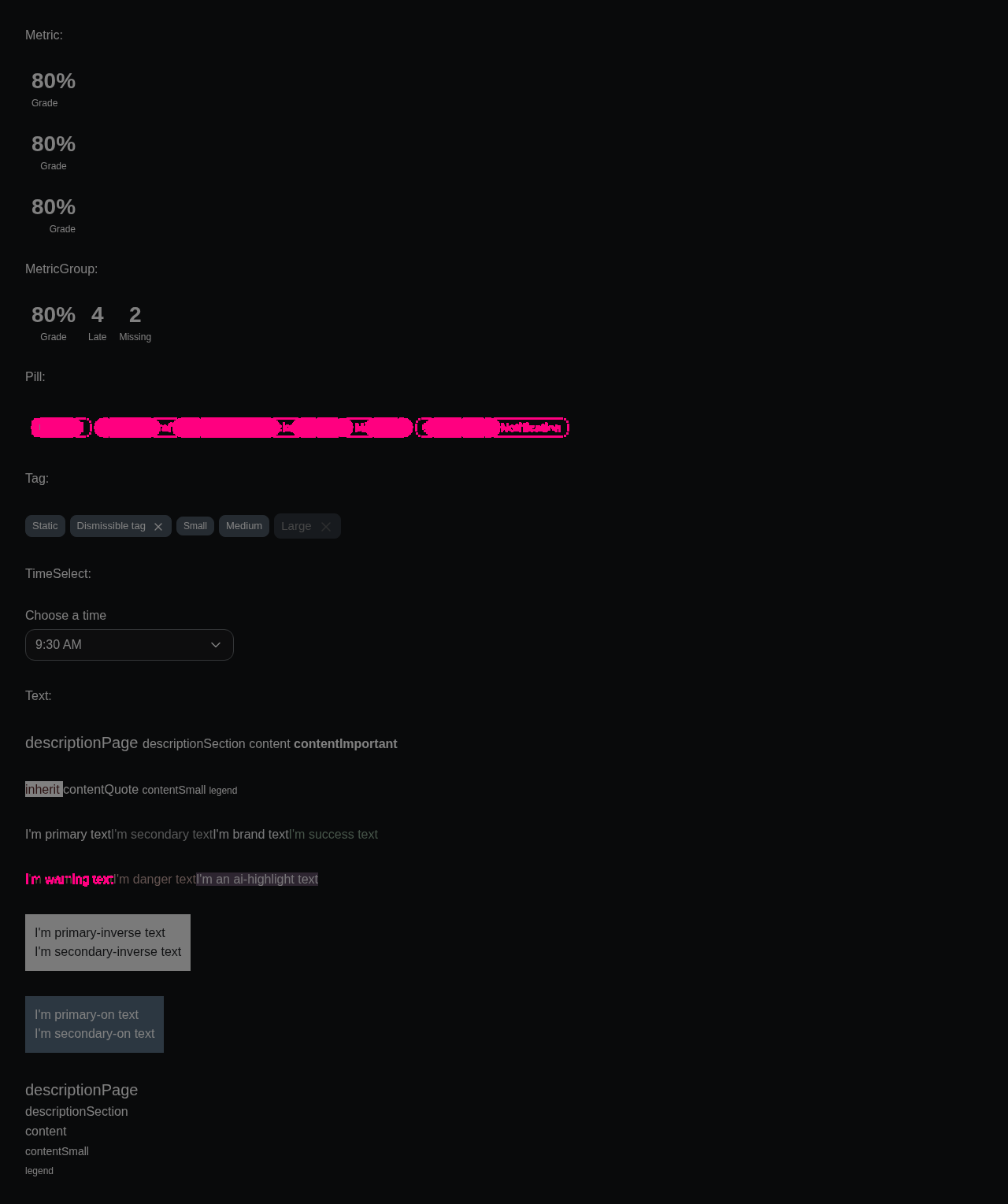
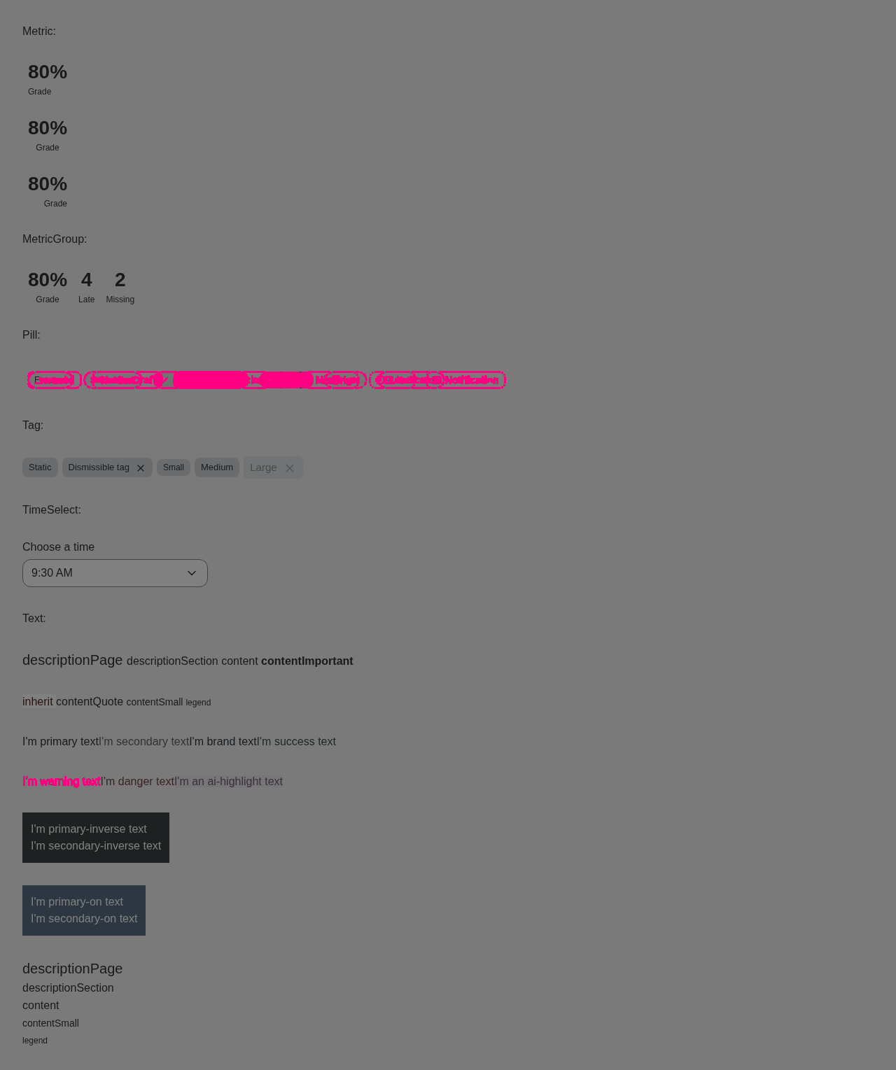
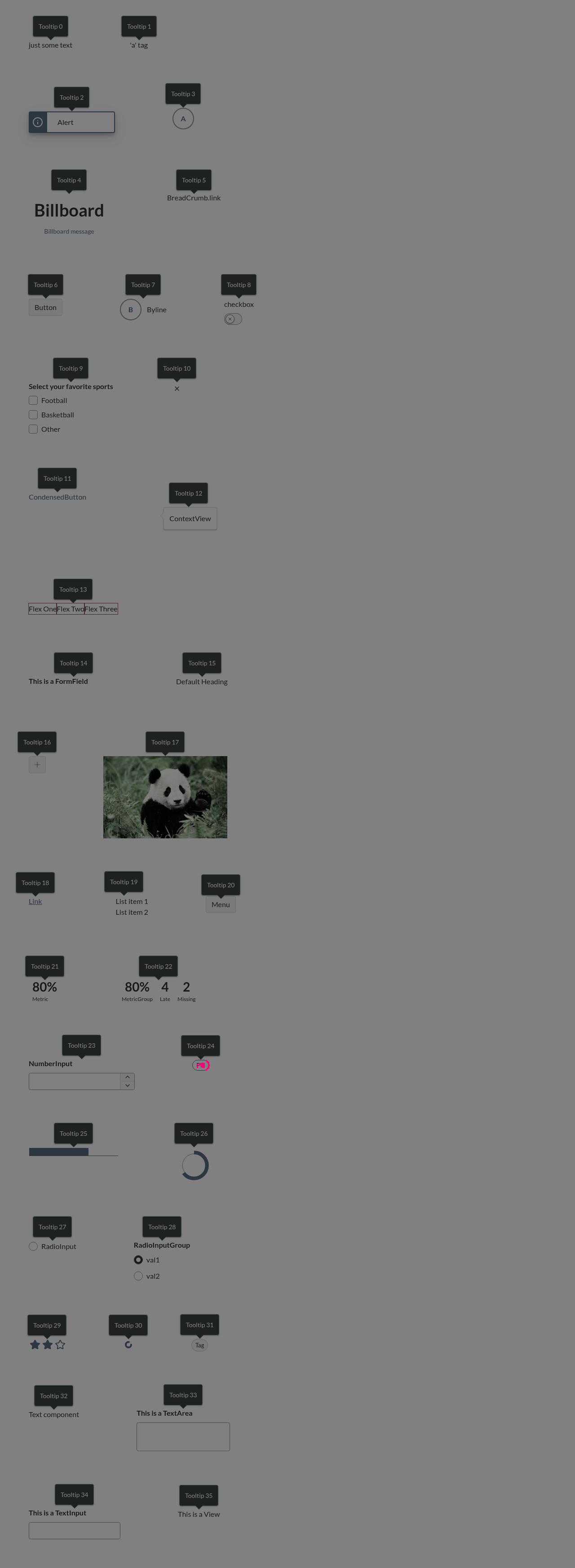
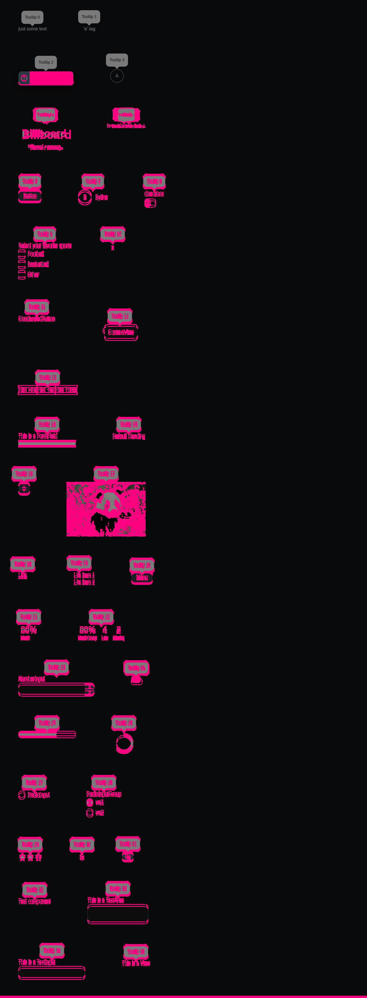
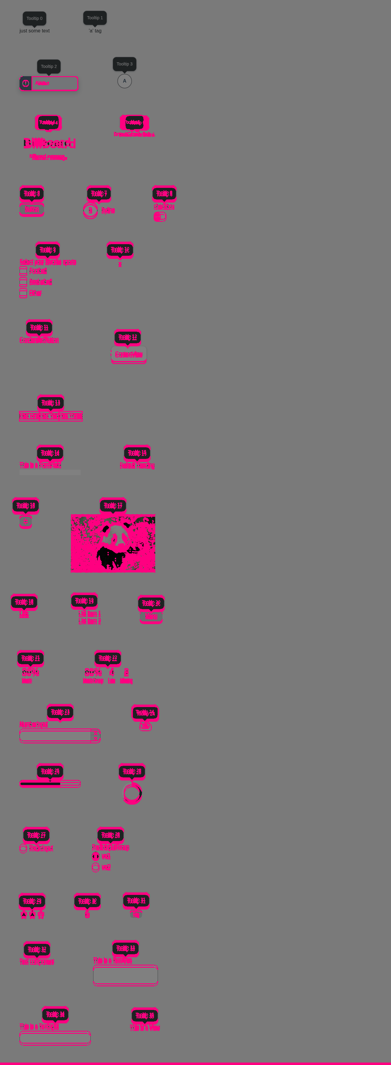
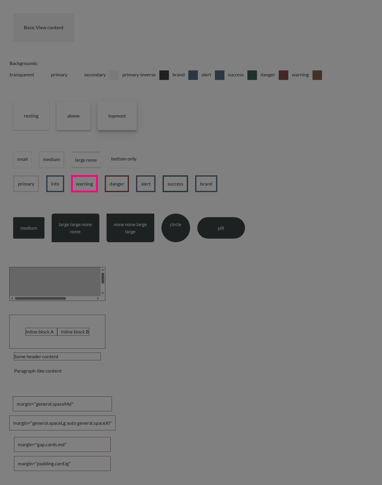
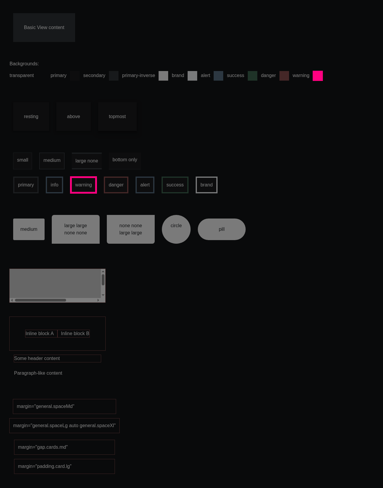
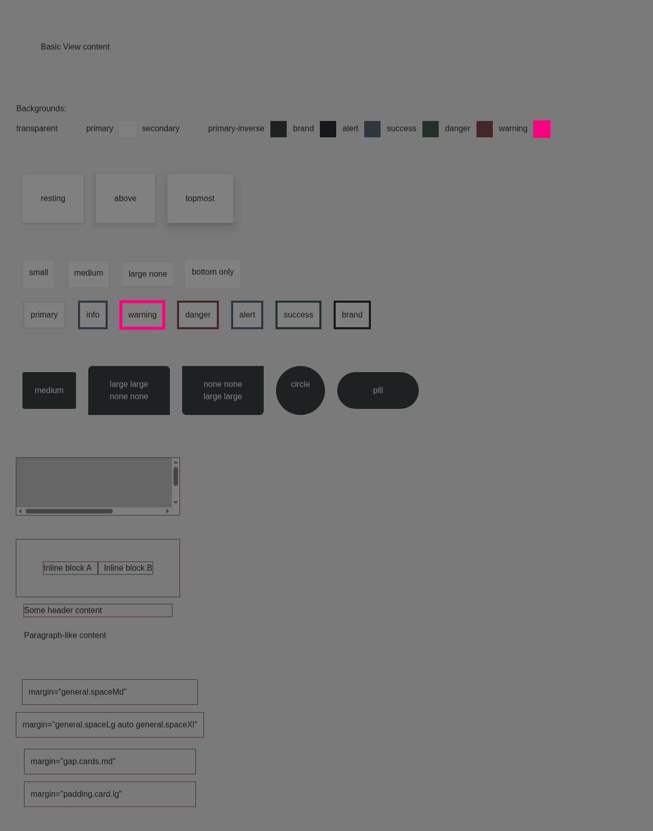
Accessibility (axe): ✅ No violations. 📊 View full report — click a screenshot's ⚠ badge to see each violation boxed on the image, with the offending element named and contrast failures shown as color swatches. Diff images (33)alert-canvas.png — 2507 pixels differalert-dark.png — 50924 pixels differalert-light.png — 24123 pixels differavatar-dark.png — 107 pixels differavatar-light.png — 107 pixels differbadge-canvas.png — 1573 pixels differbillboard-dark.png — 36899 pixels differbillboard-light.png — 36841 pixels differcolorpicker-canvas.png — 316 pixels differcolorpicker-dark.png — 53664 pixels differcolorpicker-light.png — 41507 pixels differcustom-icons-canvas.png — 565 pixels differcustom-icons-dark.png — 498 pixels differcustom-icons-light.png — 594 pixels differdrilldown-canvas.png — 130 pixels differdrilldown-dark.png — 1572 pixels differdrilldown-light.png — 986 pixels differfiledrop-dark.png — 6892 pixels differfiledrop-light.png — 6957 pixels differheading-dark.png — 27544 pixels differheading-light.png — 27459 pixels differprogressbar-canvas.png — 1661 pixels differprogressbar-dark.png — 1672 pixels differprogressbar-light.png — 1661 pixels differsmall-components-canvas.png — 1968 pixels differsmall-components-dark.png — 10747 pixels differsmall-components-light.png — 6350 pixels differtooltip-canvas.png — 65 pixels differtooltip-dark.png — 109740 pixels differtooltip-light.png — 102371 pixels differview-canvas.png — 1088 pixels differview-dark.png — 2112 pixels differview-light.png — 2112 pixels differBaselines come from the |

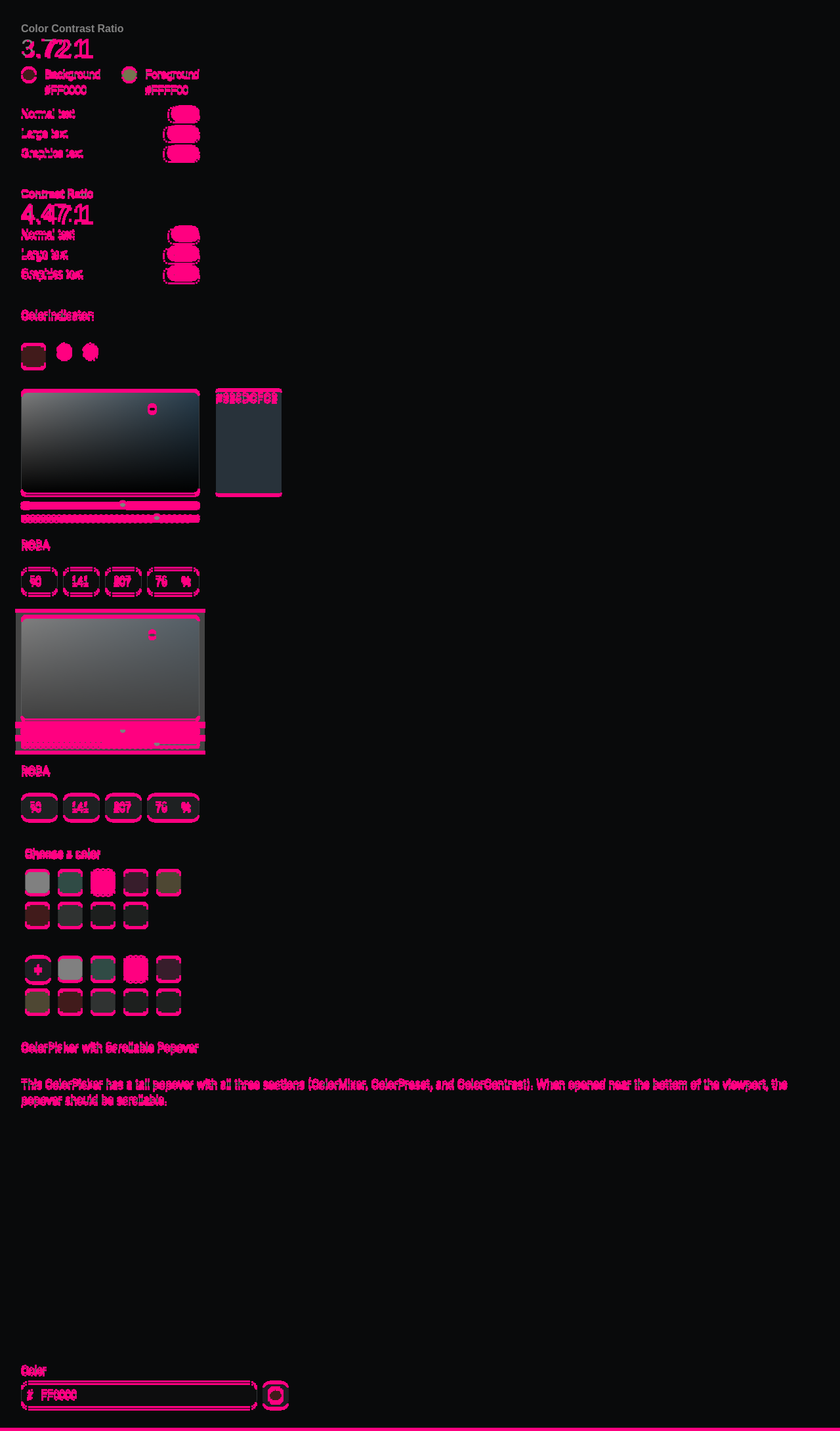
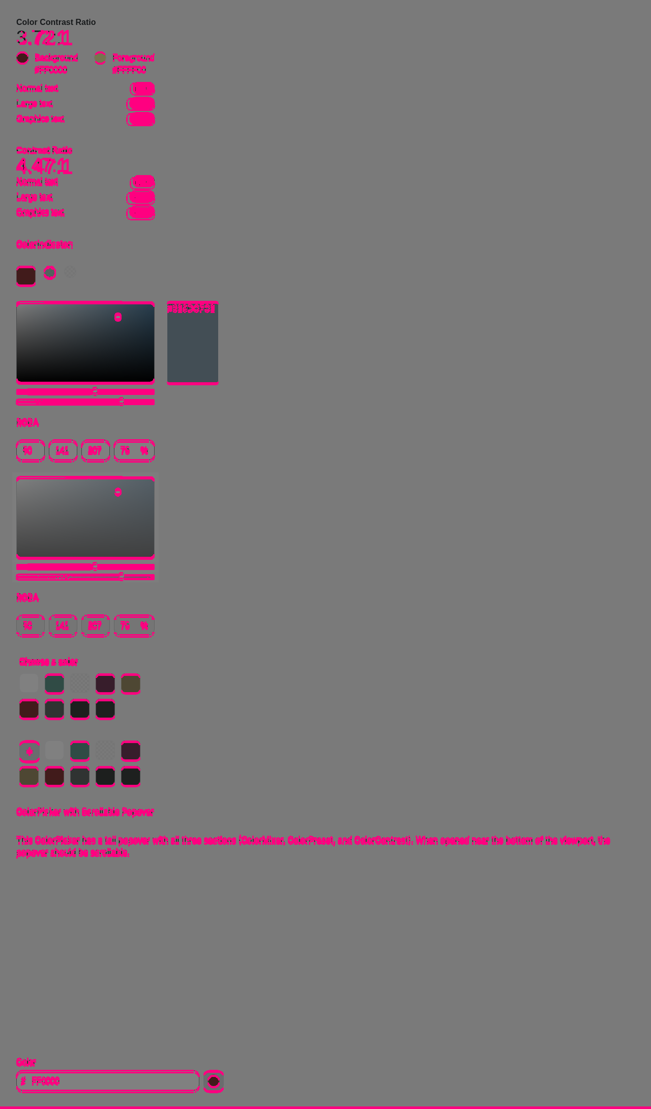
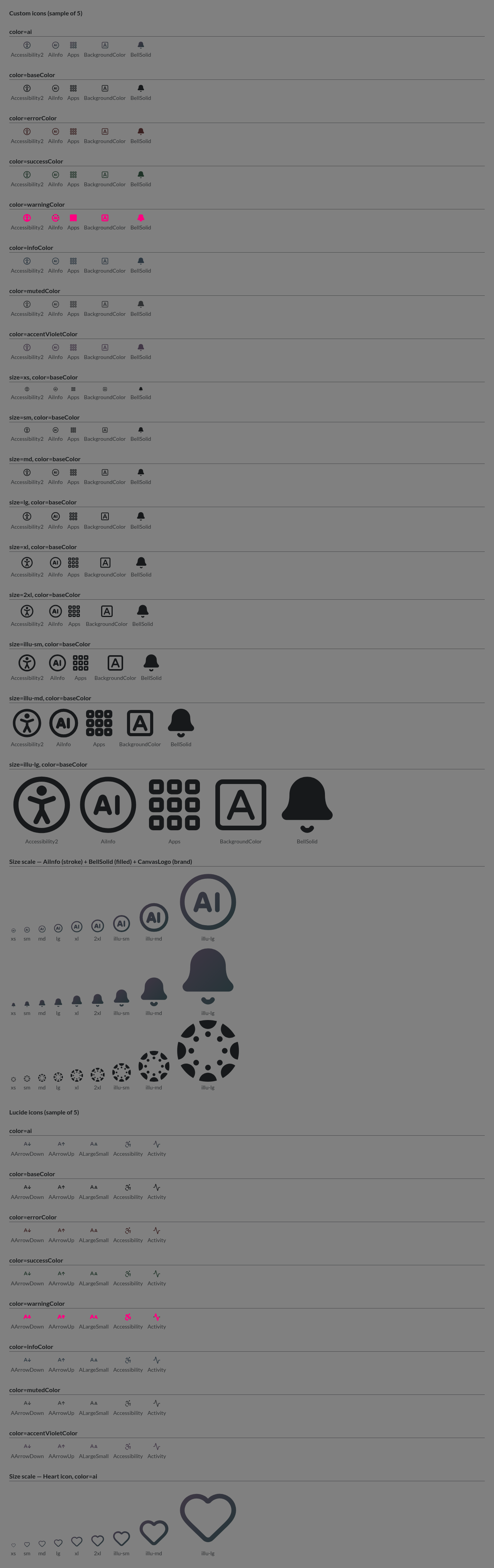
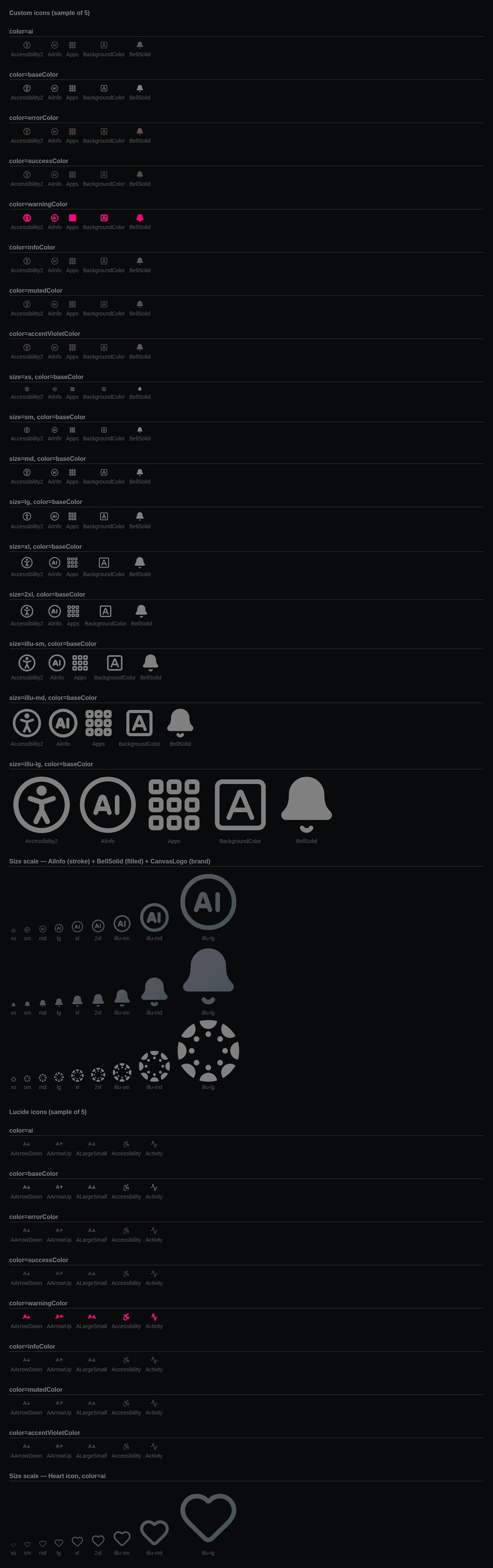



| themeOverride={{ | ||
| background: '#BF32A4', | ||
| color: 'white', | ||
| // v1.10.0 replaced Alert's single `background` token with |
There was a problem hiding this comment.
What is v1.10.0? And what has this to do with skeleton loaders?
There was a problem hiding this comment.
instructure-design-tokens update with the Skeleton tokens
There was a problem hiding this comment.
That should be v1.9.0, though: https://github.com/instructure/instructure-design-tokens/pull/17/changes
There was a problem hiding this comment.
Either way, this is more of a placeholder until the tokens work is shipped. Will be removed.
| borderColor: componentTheme.baseBorderColor, | ||
| background: componentTheme.neutralBackgroundColor | ||
| }, | ||
| success: { | ||
| color: componentTheme.successTextColor, | ||
| borderColor: componentTheme.successBorderColor | ||
| borderColor: componentTheme.successBorderColor, | ||
| background: componentTheme.successBackgroundColor | ||
| }, | ||
| info: { | ||
| color: componentTheme.infoTextColor, | ||
| borderColor: componentTheme.infoBorderColor | ||
| borderColor: componentTheme.infoBorderColor, | ||
| background: componentTheme.infoBackgroundColor | ||
| }, | ||
| warning: { | ||
| color: componentTheme.warningTextColor, | ||
| borderColor: componentTheme.warningBorderColor | ||
| borderColor: componentTheme.warningBorderColor, | ||
| background: componentTheme.warningBackgroundColor | ||
| }, | ||
| error: { | ||
| color: componentTheme.errorTextColor, | ||
| borderColor: componentTheme.errorBorderColor | ||
| borderColor: componentTheme.errorBorderColor, |
There was a problem hiding this comment.
I guess these (and the other theme changes) will be deleted once we can upgrade the design tokens version?
| * | ||
| * Doing it here rather than in each component matters for three reasons: | ||
| * - class components can consume context but cannot call hooks, so this is what | ||
| * lets `View` participate without being rewritten |
There was a problem hiding this comment.
just FYI we have lots of class-based React components as of now, just just View
 matyasf
left a comment
matyasf
left a comment
matyasf
left a comment
There was a problem hiding this comment.
See my comments.
I think the code is mostly OK (except for the skeleton shapes and HYDRATED_ATTRIBUTE removed, see my comments), and please rephrase the comments/documentation made by Claude, its so convoluted and hard to read.
| * This is the only correct way to branch on hydration. A `typeof document !== | ||
| * 'undefined'` check does not work: `document` is already defined while | ||
| * `hydrateRoot` is running, so the server would render one tree and the first | ||
| * client render another. React treats that as a hydration mismatch and throws | ||
| * away the server HTML for that subtree. | ||
| * | ||
| * `useSyncExternalStore` avoids the mismatch by construction — React is | ||
| * required to use `getServerSnapshot` for the hydrating render and | ||
| * `getSnapshot` only afterwards. |
There was a problem hiding this comment.
I think most of this comment is not needed. Also "This is the only correct way to branch on hydration" -- what about class components? shoudnt they use HydrationGate?
| * Prefer `useIsHydratedContext` from `HydrationContext` inside InstUI, so the | ||
| * whole page flips in a single commit instead of once per component. | ||
| * |
There was a problem hiding this comment.
Either make this a private API or omit comments talking about how InstUI should work internally, this is just confusing for users
| --- | ||
| type: example | ||
| --- | ||
| class Example extends React.Component { |
There was a problem hiding this comment.
Please always make functional React examples (unless it demonstrates some class based functionality)
| `SkeletonLoader` wraps a loading region and owns everything assistive technology | ||
| needs to know about it: the busy state, the polite announcement, and the error | ||
| interruption. The shapes themselves are decorative and announce nothing. | ||
|
|
||
| Render **one of these per region**, not one per card or row. A page that | ||
| announces once per skeleton row is unusable with a screen reader. |
There was a problem hiding this comment.
This is not needed; the docs app renders the comment above the component too, so this becomes a repetition

| Wraps a loading region and owns everything a screen reader needs to know about | ||
| it. The skeleton shapes themselves are decorative; this is what announces. |
There was a problem hiding this comment.
Can you please rephrase this to less Claude speak? "owns everything a screen reader needs to know about" What does this mean? What does a screen reader need to know about? Does it simply mean that the loading is announced by screen readers, e.g. it has a live region?
the skeleton shapes themselves are decorative; this is what announces.
So are they purely decorative or they serve some other purpose too?
| * aliases, documented alongside the shape they bind rather than as separate | ||
| * pages in the nav. | ||
| */ | ||
| const bindShape = (shape: SkeletonShapeProps['shape'], displayName: string) => { |
There was a problem hiding this comment.
This would not be needed if the shapes would be different components (this would also simplify other things.)
| */ | ||
| skeletonLines?: number | ||
| /** | ||
| * Type ramp step for `skeletonShape="text"`. |
There was a problem hiding this comment.
What is a "Type ramp step"?
| single [SkeletonLoader](#SkeletonLoader) region wrapping the whole area — one | ||
| per region, never one per View. |
There was a problem hiding this comment.
"the whole area — one per region, never one per View."
this is a bit hard to read here, I would remove it. It should be explained in SkeletonLoader
| {...passthroughProps(props)} | ||
| aria-busy={loading || undefined} |
There was a problem hiding this comment.
aria-busy should be set before passtroughProps, so users can override it if needed
| return () => root.removeAttribute(HYDRATED_ATTRIBUTE) | ||
| }, []) |
There was a problem hiding this comment.
HYDRATED_ATTRIBUTE is removed if this is unmounted. There can be multiple InstUISettingsProvider in a DOM tree, wont this be an issue if one is removed?
2 participants


This PR:
useIsHydratedcontext provider inui-react-utils<SkeletonLoader>component and<SkeletonShape>sub-component